Fish2O
A corporate website for a seafood producer
- Client
- Fish2O
- Our work
- Research · UX/UI · Tilda website · Email design
Project overview
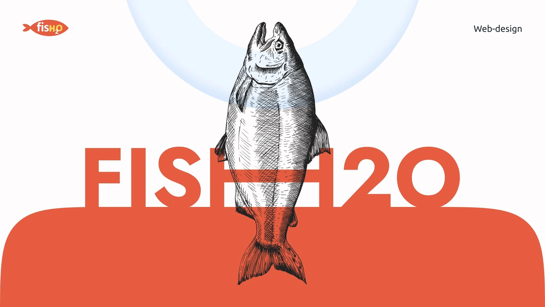
Fish2O is a brand of a Murmansk-based group producing and selling fish and seafood. It needed a corporate website showcasing both the products and the operation behind them. Our work later extended to email communications and branded clothing concepts.
The brief
We needed to present the company with a distinctive voice: show the range, explain production and support sales. The visual direction had to express the brand and let visitors examine the product, while preserving clear structure and full mobile functionality.
What we did
01 / Validating the structure before design
We studied Russian and international seafood producers’ websites and gathered ideas from other industries, rather than limiting the design to conventions in the seafood sector.
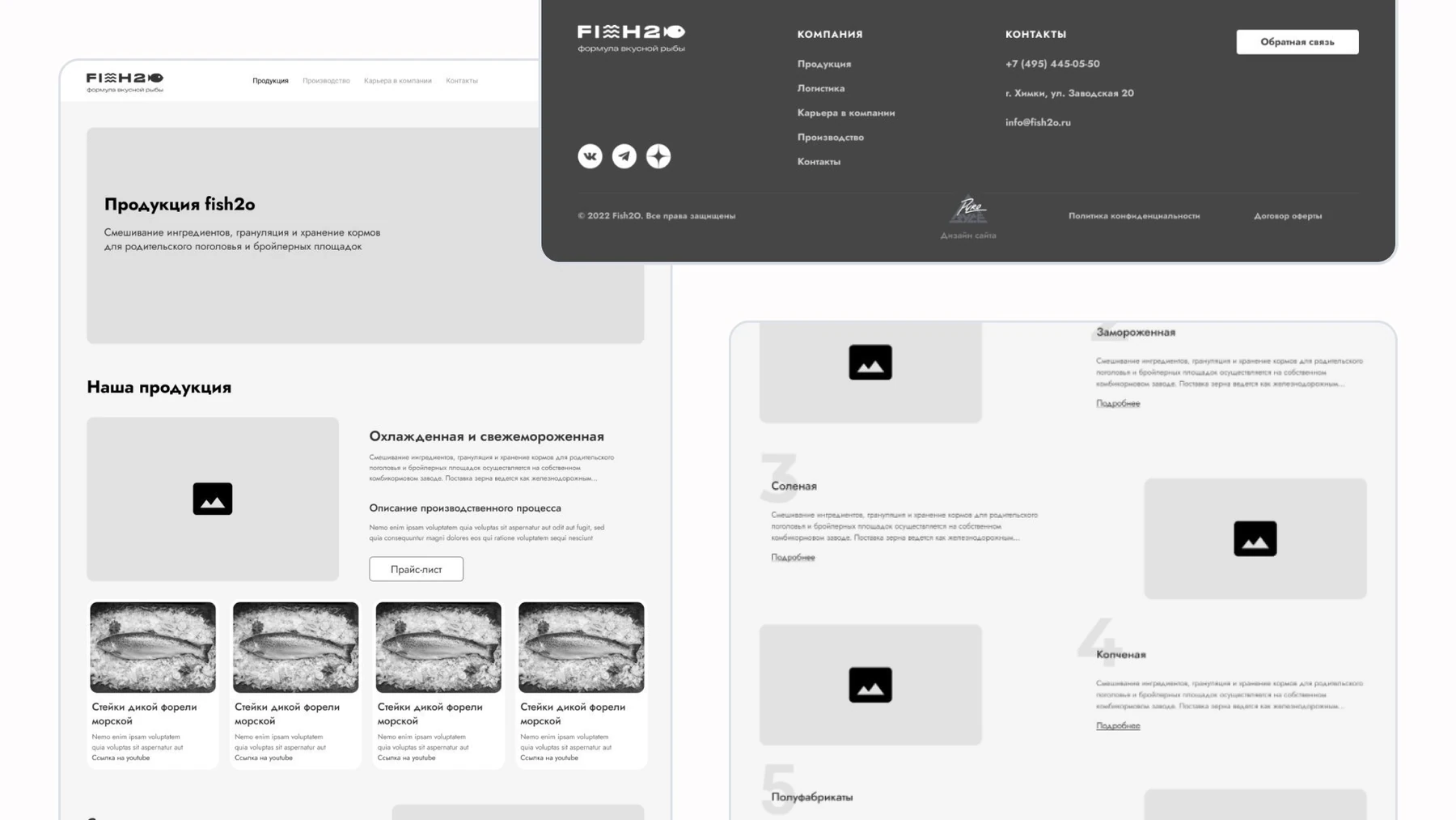
We created a structure and a clickable monochrome prototype. This let the team explore sections, review content and functionality, and make changes before visual design began.
02 / Showing the product and production
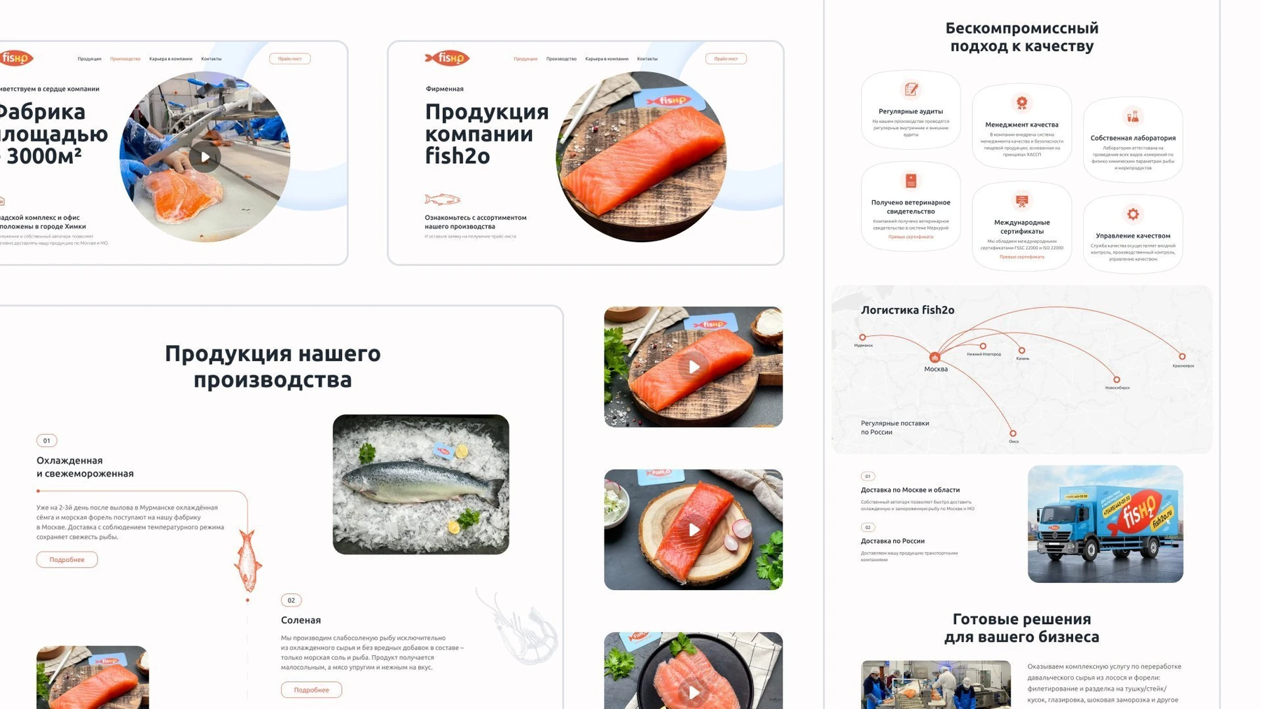
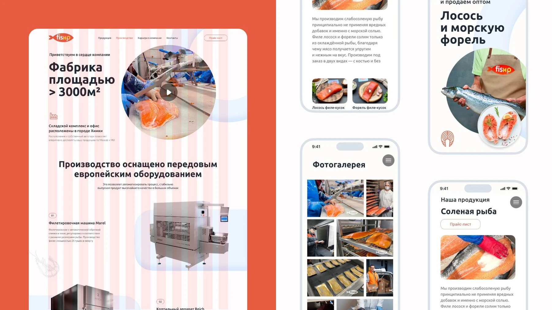
We chose a warm, bright palette, large photography and expressive headlines. Dedicated product and production sections let visitors examine the fish and dishes before exploring the company and its processes.
Layouts use a 12-column grid adapted for mobile. We built the site on Tilda with video, a fishing animation, parallax and a progress indicator. Motion accompanies page transitions and connects the sections.
03 / Continuing the conversation by email
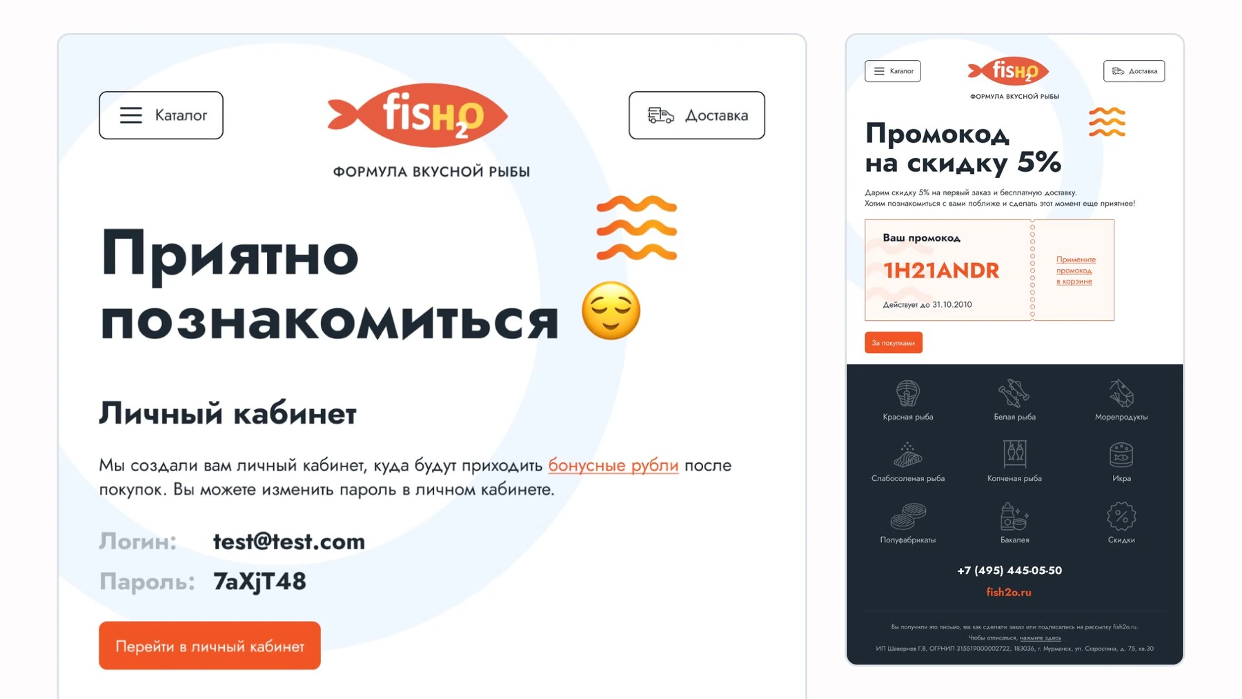
We designed a welcome sequence and abandoned-basket emails. Each scenario has its own presentation within the brand style: introducing the company, making a personal offer or returning to a purchase.
CRM integration supports personalisation. Emails include individual promo codes and recipe selections based on the fish ordered, connecting content to each buyer’s interests rather than sending the same advertisement to everyone.
04 / Taking the identity beyond the screen
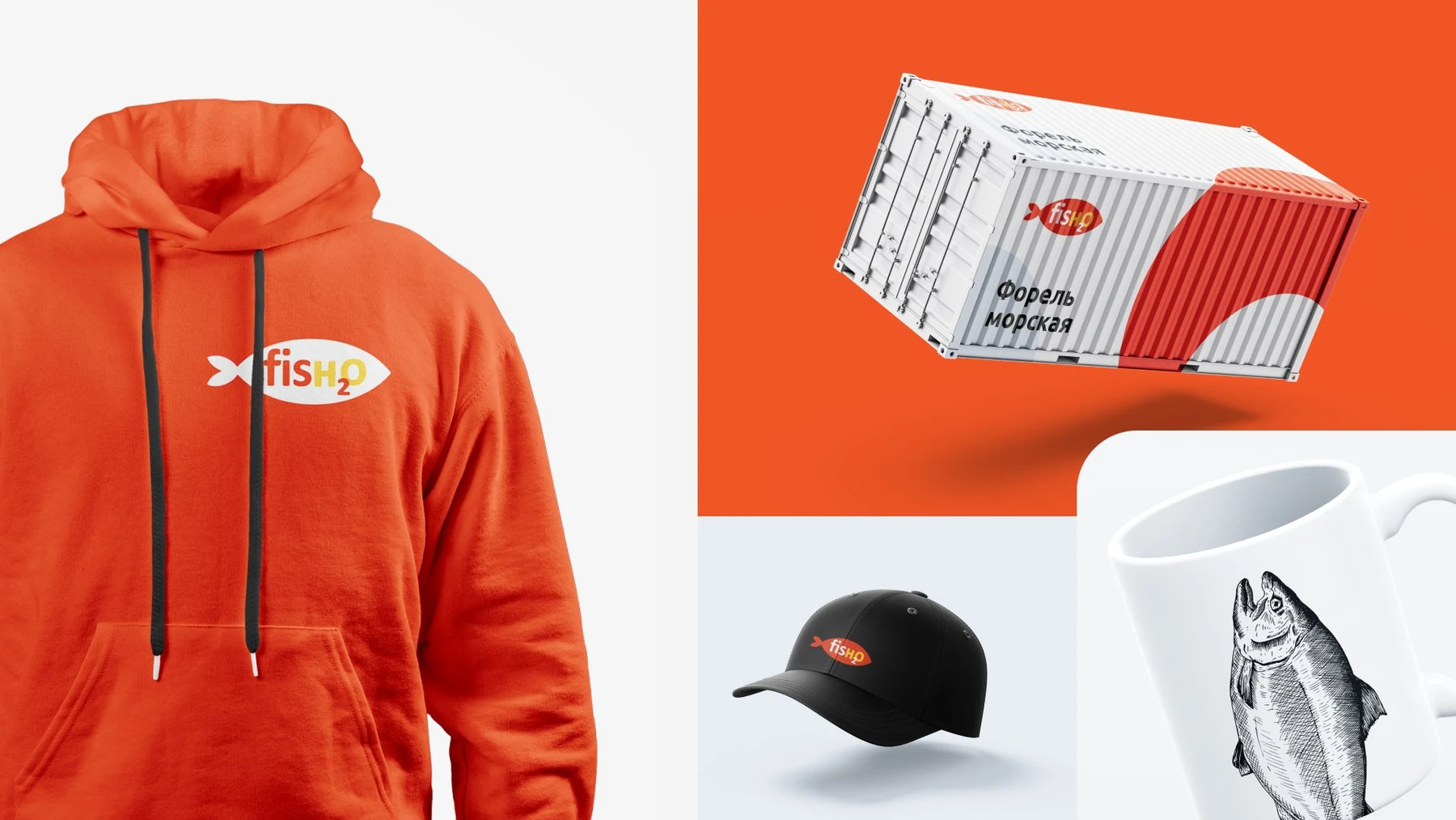
Next, we developed concepts for staff clothing and workwear using the brand’s symbols and website colours. Everyday clothing and protective workwear serve different purposes but should clearly represent the same company.
Mockups showed the visual language on clothing and other branded items. This let us assess the identity as a whole, from the website to physical encounters with the brand.
Results
We delivered a responsive corporate website, email design system and branded merchandise concepts. Products and production received dedicated sections, and the visual identity continued into customer communications.
The project took second place at Workspace Digital Awards 2023 in Integrated Services / Industry and Equipment.