SOMFORT / EvoCom
The SOMFORT website: sensitive communication, hygiene product selection and useful guidance.
Figures and scope of work at the time the original case study was published
- Our work
- UX/UI · Web development · 1C-Bitrix · Integrations
The brand and the website task
In 2025, EvoCom was bringing SOMFORT to market: a hygiene brand for people experiencing incontinence. The subject can be difficult to discuss and is often associated with embarrassment and anxiety.
The brand communication is based on practical help, reassurance and respect. The website needed to extend that approach.
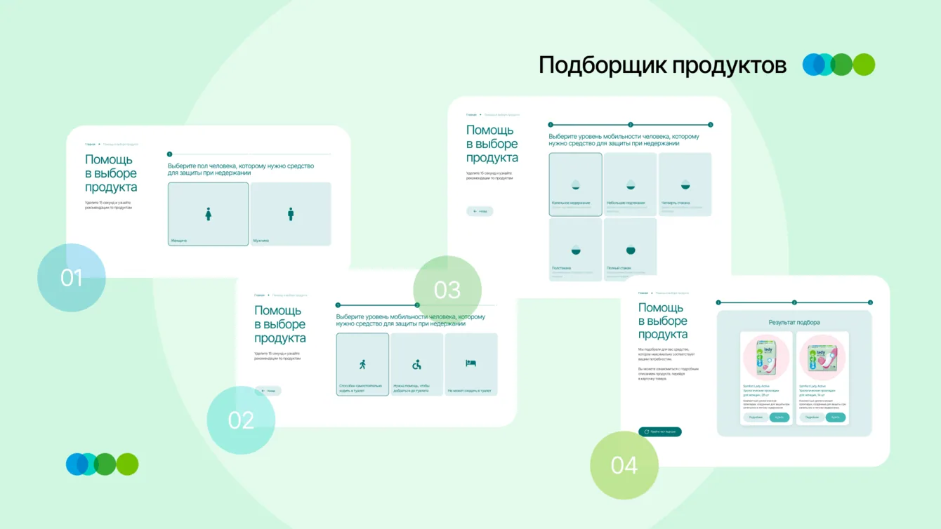
A corporate product showcase alone would not be enough. Visitors also needed guidance, instructions and tools to select suitable products.
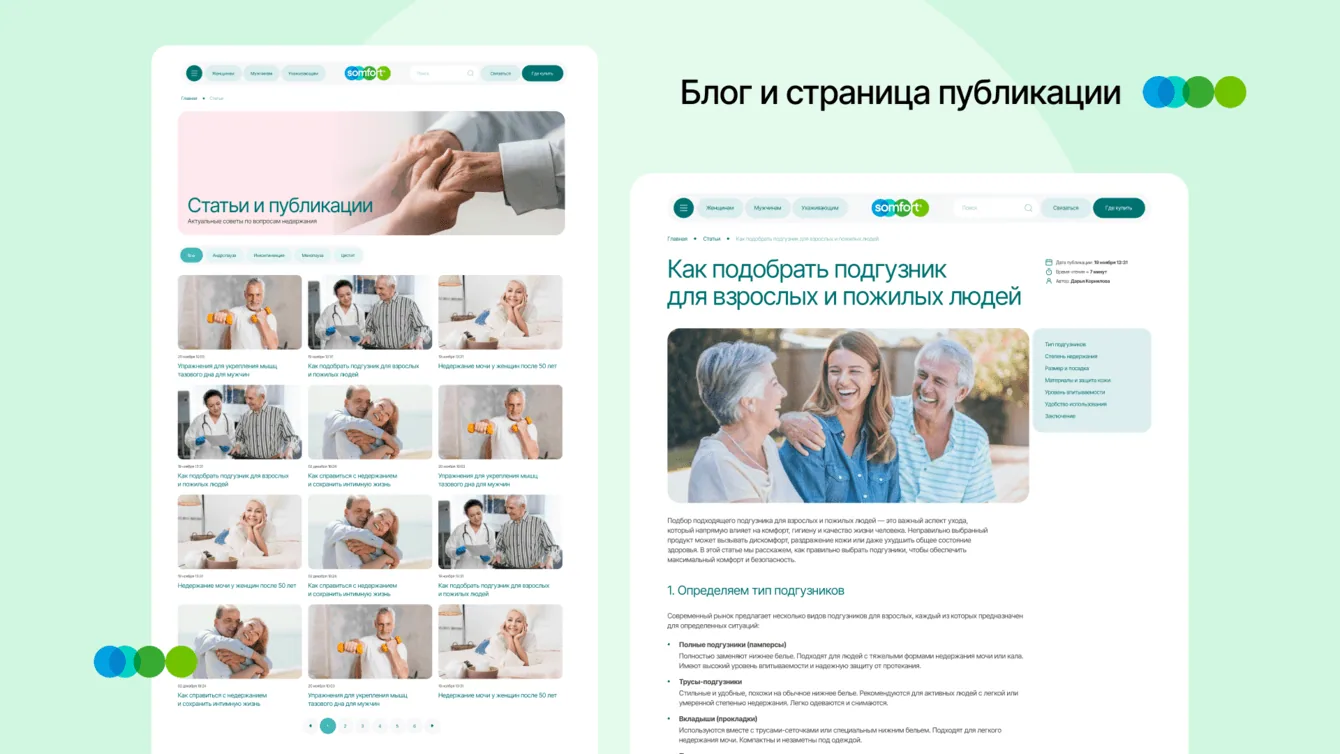
Different user needs
Before the tender, the SOMFORT team had researched the market and its audiences. We used those findings to understand the experience each group needed.
- First-time users need sensitive, respectful information as well as help choosing products
- Carers need clear instructions and confidence in the brand
- Returning customers need fast navigation and quick access to familiar information
We organised the site to reduce discomfort and answer common concerns about the products.
The explanatory content, calm visual design and short product selection quiz all serve the same purpose: making the next step easier to understand.
Palette, product ranges and visual language
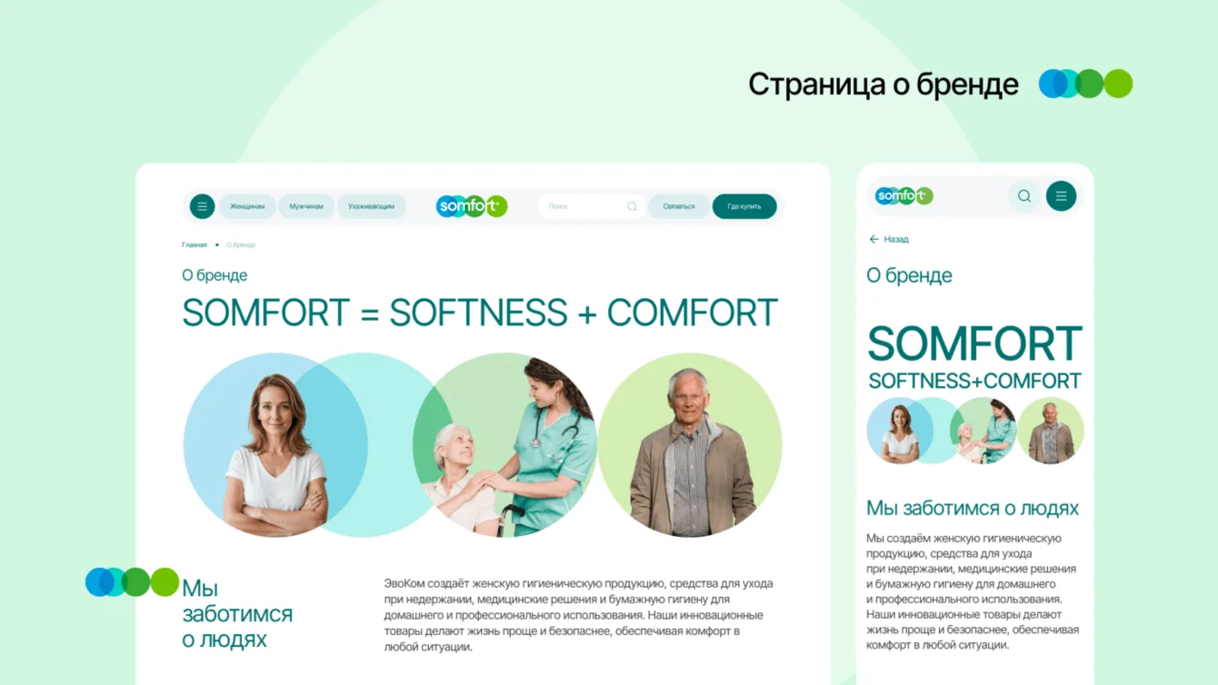
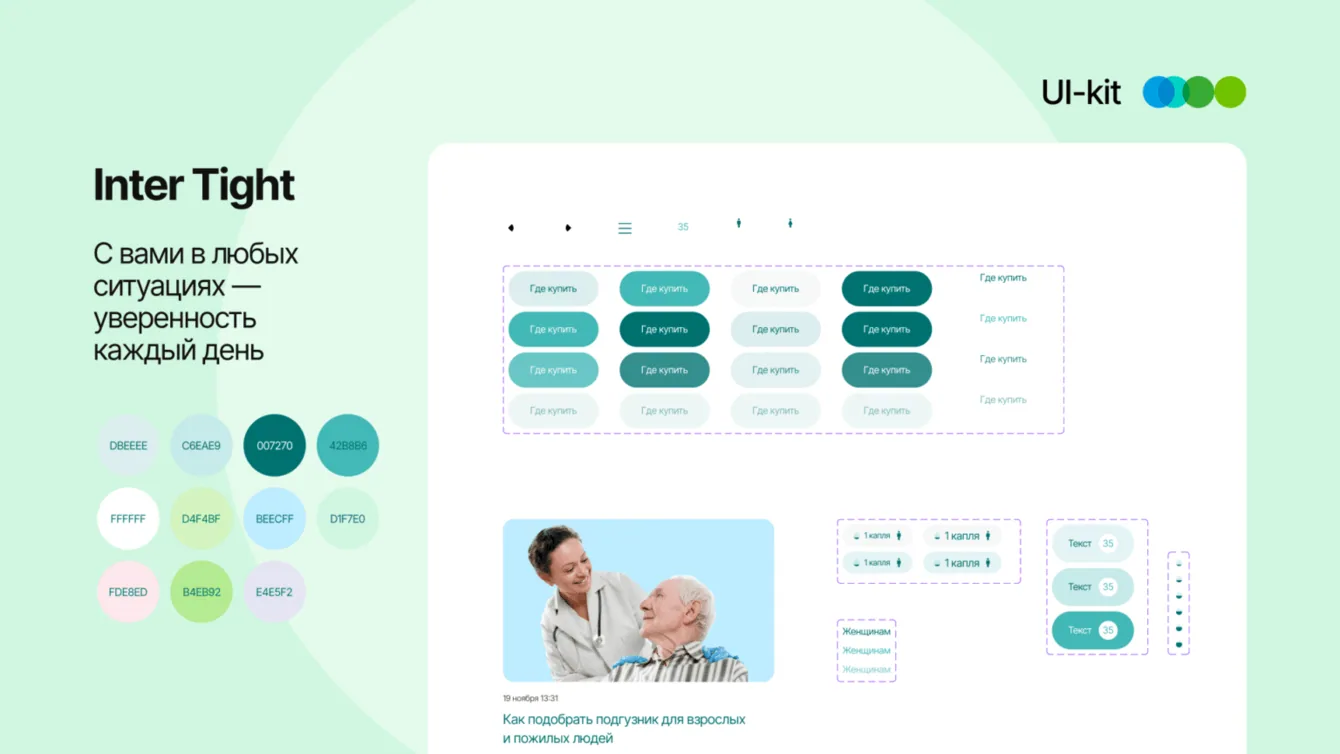
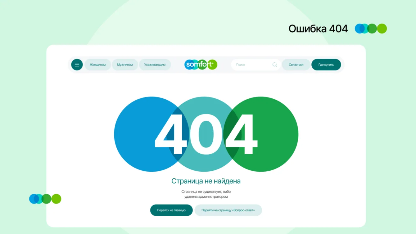
The logo palette guided the interface: sea green and soft pastel shades establish a calm visual foundation.
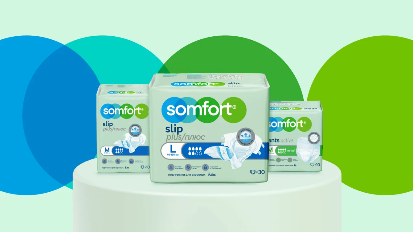
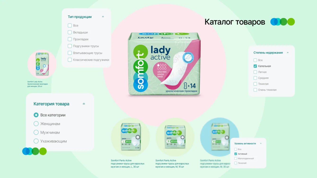
We kept product ranges consistent with packaging colours — pink, green and blue — so customers can identify the right category quickly.
Platform constraints ruled out the proposed 3D treatment. We used restrained hover effects to keep interactive elements expressive without adding complexity.
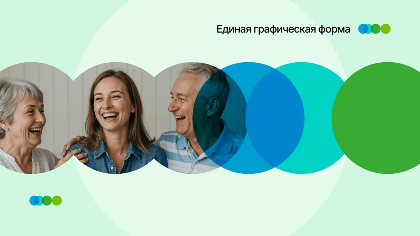
Circular shapes echo the logo and the brand idea of support. Photographs of people reinforce that approachable visual identity.
Bitrix and content administration
- The tender specified 1C-Bitrix as the CMS
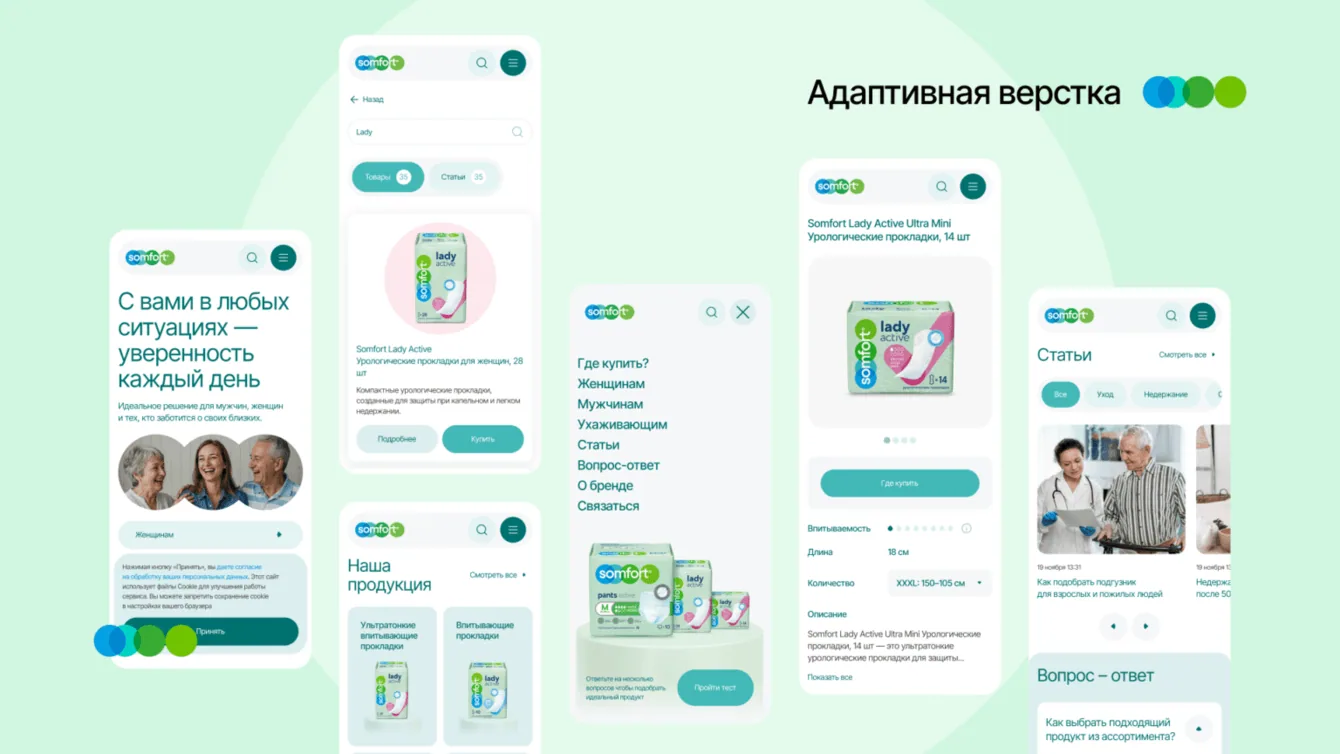
- The site needed responsive layouts and cross-browser support
- Analytics integrations included Yandex Metrica and VK counters
We worked through CMS issues and adapted the administration panel to the client’s requirements.
Administrators can update articles, images, banners, links and filters. We added three access roles, user management and the ability to copy pages into different sections.
That gives the client control over routine content updates. Technical support remains available for issues that require development work.
Purchasing, analytics and testing
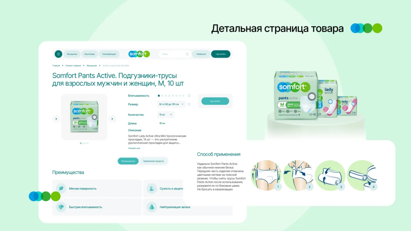
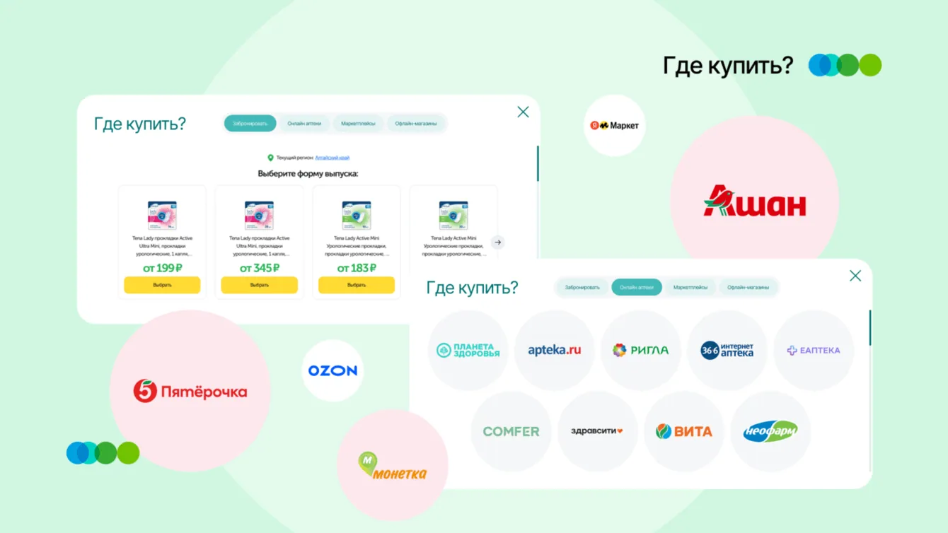
We integrated the Uteka online pharmacy service. Product cards give visitors a route from selecting a suitable product to finding a purchase option.
Yandex Metrica provides information about user journeys and points where people drop out, supporting later improvements.
Search preparation included readable URLs, breadcrumbs, semantic markup, performance work and server-side rendering.
We tested the site in the main browsers and on Huawei, Xiaomi and iPhone devices.
The result
Figures and scope of work at the time the original case study was published
The site launched in three and a half months. It combines product selection with guidance and personal stories, making a sensitive topic easier to approach.
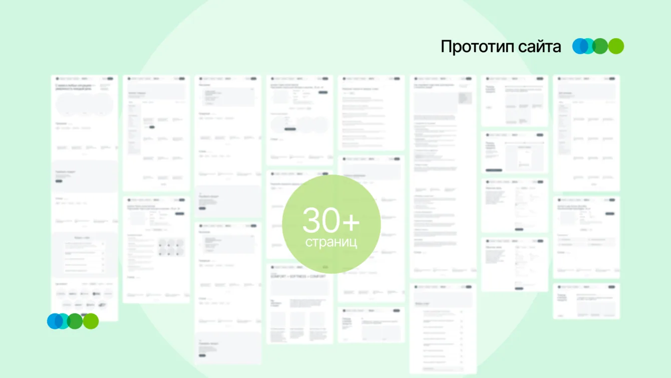
The structure, selection quiz and navigation by range, size and absorbency help users reach a suitable product.
After launch, the project continued under technical support, with further search optimisation building on the initial SEO work.