Vash Stomatolog
A dental clinic website redesign with online appointments and a distinctive visual identity.
- Our work
- Research · UX/UI · Webflow
- Platform
- Webflow
- Scope
- Up to 20 information pages · Cinemagraphs · Online appointments
The clinic task
Vash Stomatolog needed to replace a WordPress website that was more than ten years old. The new site had to explain treatments and make appointment booking easier.
- Build a clinic website with a simpler appointment booking flow
- Make the design useful and memorable, with a distinctive emotional character
What patients need
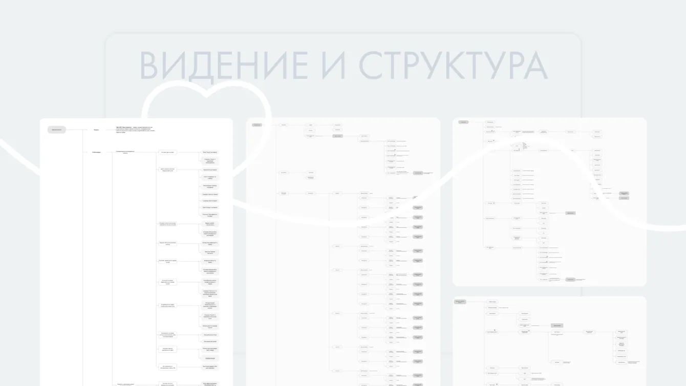
Discovery covered audiences, competitors, priorities and information structure. We considered the clinic owner, regular patients and people choosing a dental practice for their family.
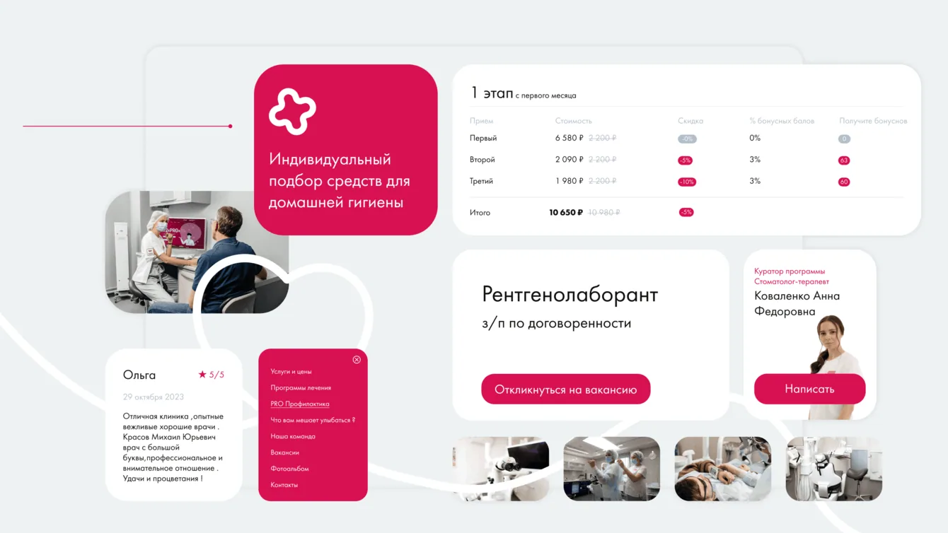
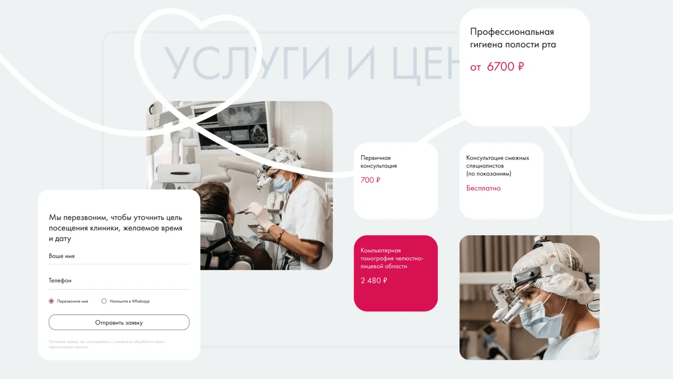
Patients often visit a website to check prices and the approach to treatment, then have to call because the information is hard to find.
We brought detailed treatment information, current pricing, reviews and answers to frequent questions into the website structure.
Contact options include directions in the header, a map, clickable phone numbers, booking forms and a widget that sends enquiries to the manager messenger.
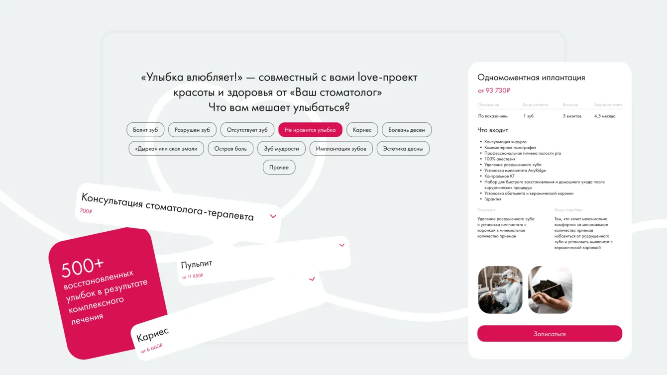
For patients unfamiliar with dental terminology, we designed an interactive guide with explanations, a filterable services page and navigation tools.
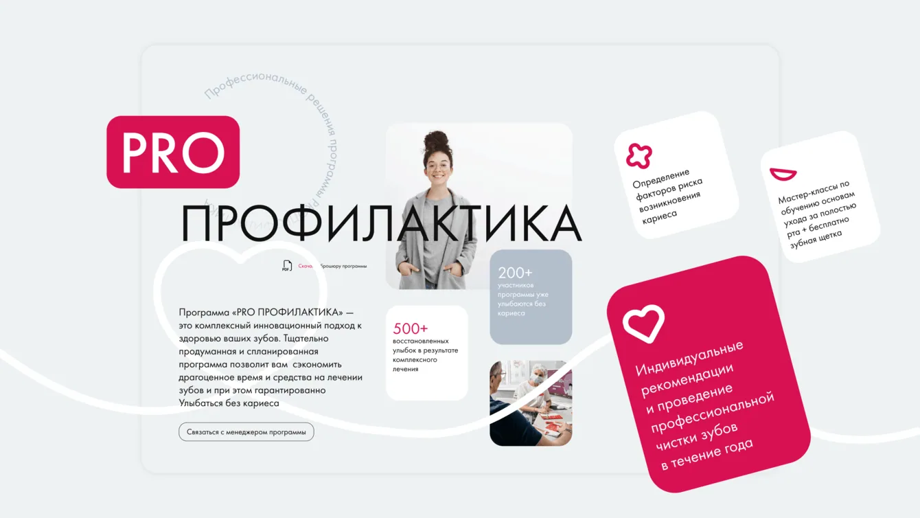
We brought the clinic PROfilaktika programme into the main website. Previously, its information lived on a separate domain.
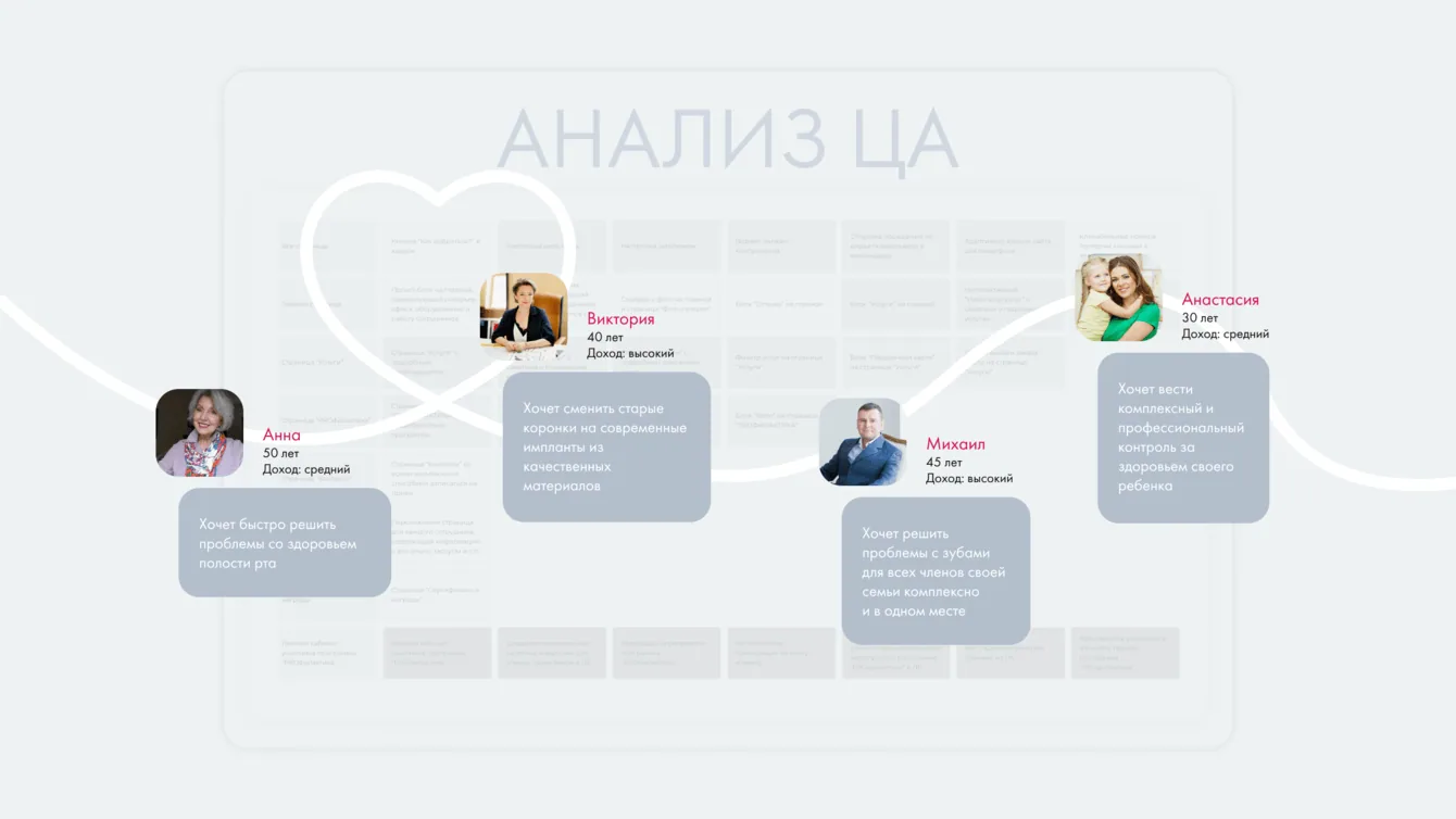
We used personas to describe the motivations and behaviour of the main audience groups, giving the design team specific scenarios to work with.
AI tools helped us organise that research more quickly while keeping the focus on the audience and the project task.
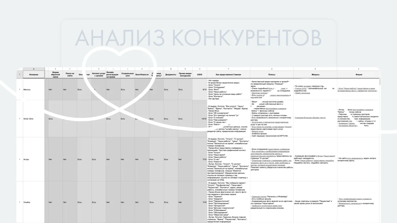
We examined direct and indirect competitors, including local, national and international examples.
The comparison covered offers, positioning, prices and discounts. We documented strengths, weaknesses and ideas for the new website.
We then mapped the functional sections, page relationships and navigation logic, and presented the structure for approval.
Concept and cinemagraphs
Visual briefing helped us understand the client’s preferences and expectations. A moodboard established the desired style before detailed design began.
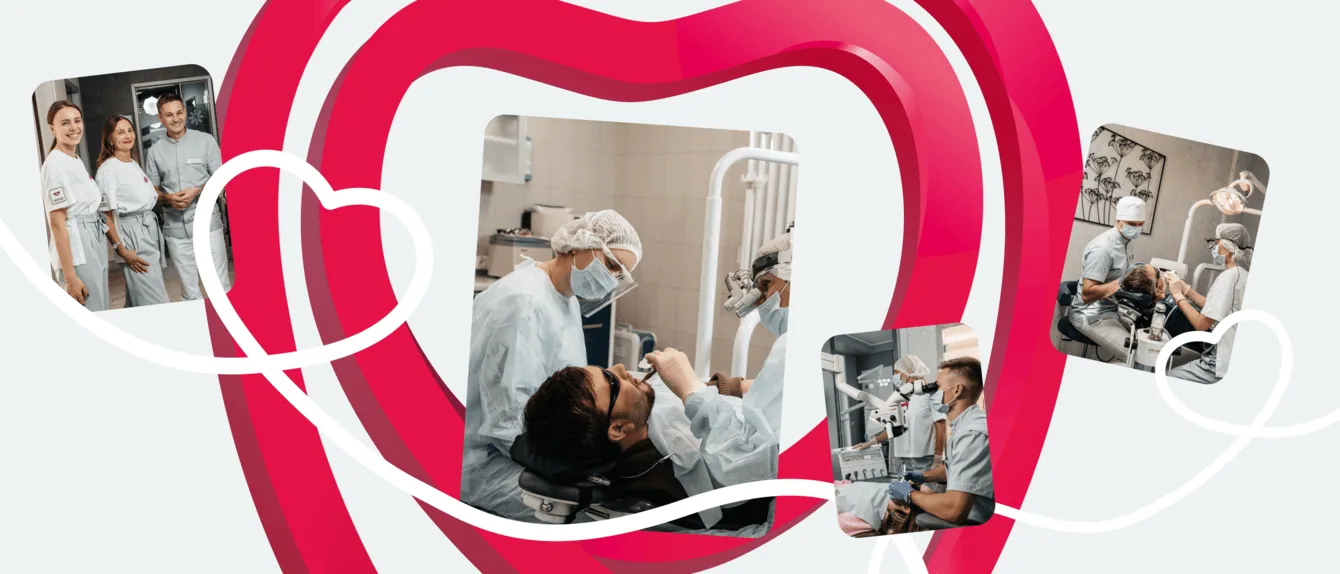
After reviewing the first concept, the client supported a more expressive direction. We used large typography and soft rounded forms to keep the site open and approachable.
A white line connects the pages, wraps around the tooth-shaped logo and provides a consistent visual motif.
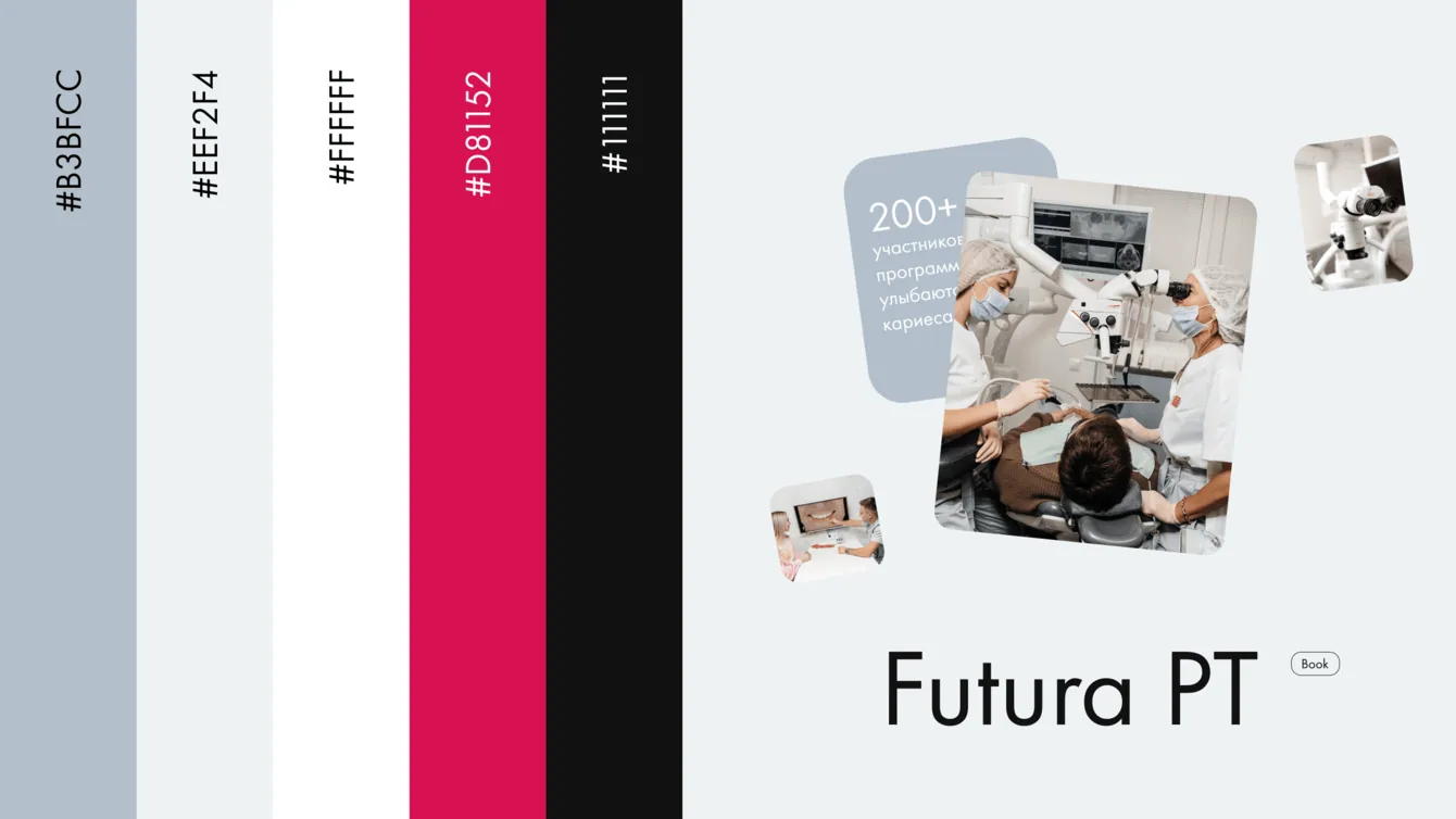
Cinemagraphs of smiling people became the homepage feature, presenting the clinic in a reassuring way. The client also chose to use this visual approach in advertising.
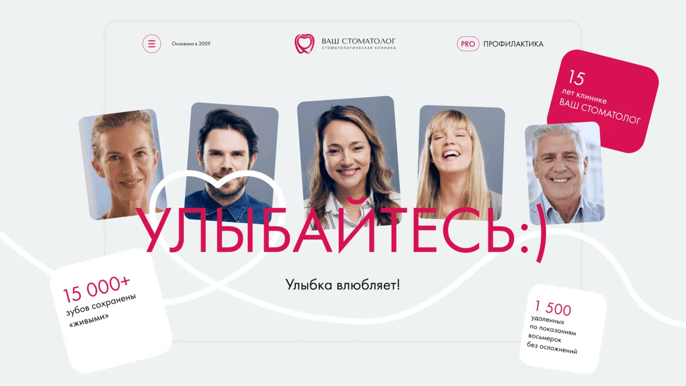
We also designed the smartphone version so patients can find information and book from their preferred device.
Treatments, pricing and appointments
- The site includes up to twenty information pages: services, staff, careers, contacts, patient information, certificates, awards and a treatment portfolio.
- We implemented online appointment enquiries and a route to requesting an online consultation.
Content and the choice of Webflow
The client supplied the copy. We adapted its presentation to fit the visual concept while preserving its substance.
We selected Webflow instead of the initially considered Tilda implementation. The design required more flexibility, and the client needed to update service and price information without asking developers for every change.
The result
The completed website combines the client ideas with a clear patient journey: understand the clinic, explore treatment options and make an appointment.
The owner stayed involved and provided prompt feedback, helping us align the visual direction with the needs of the clinic and its patients.