Magic Flower
A mobile flower shop design with brand mascots and straightforward ordering.
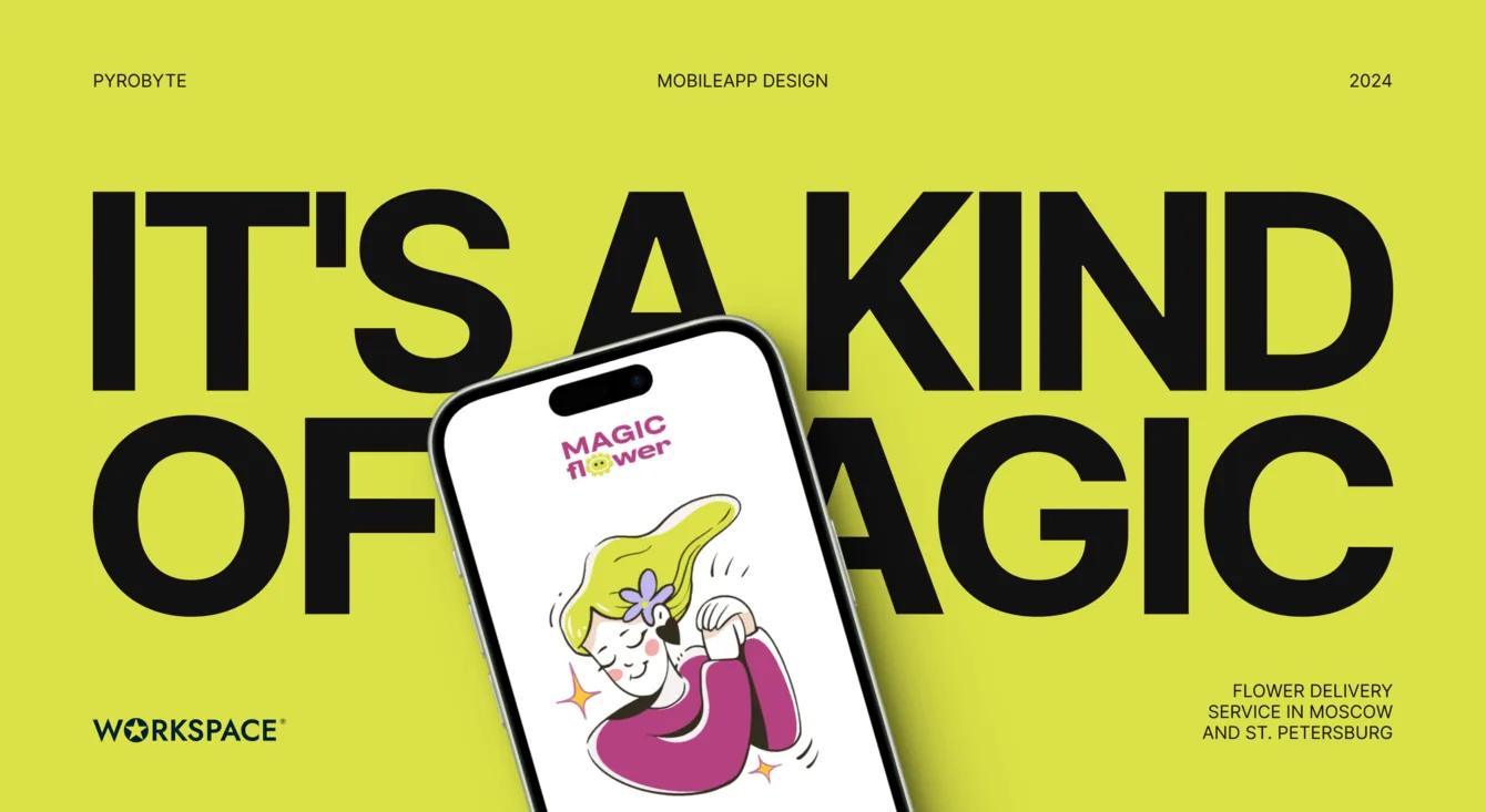
- Our work
- Audience research · UX/UI · Mobile app design
- Design scope
- Around 50 features · Prototype · UI kit · Mascots · Onboarding
The task and constraints
A Moscow flower business needed a mobile app design. The client already had work from other contractors, but wanted a fresher and more expressive direction.
There were two main requirements: a minimalist interface and consistency with the existing brand book.
The identity already appeared on the website, merchandise and shops in Moscow and St Petersburg. Replacing it would have broken that connection. Its flower mascots became the starting point for our design.
Research and prototype
Before designing, we checked whether customers actually needed an app. We studied behaviour on the website and social media and reviewed competitors, including Flowwow, whose minimalism appealed to the client.
The research supported an app, provided that its experience stayed simple and convenient.
We also reviewed app store requirements to identify risks and prepare recommendations for the development team.
We documented the product structure and functionality. The resulting scope contained around 50 features to design.
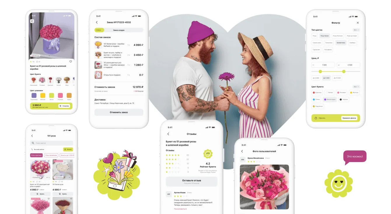
The prototype used realistic dimensions and typography, so the client could assess the interface early. We worked through ordering flows to make buying a bouquet possible in just a few steps.
Interface and brand identity
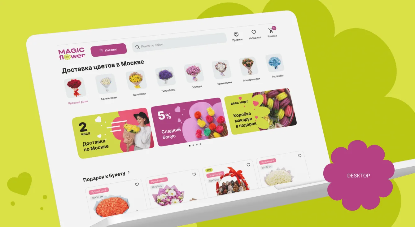
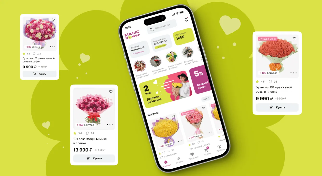
With the logic established, we focused on the visual experience: light navigation, expressive product cards and a short ordering process. Each detail kept the brand recognisable.
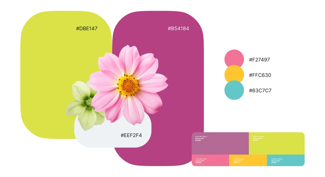
Flowwow served as a reference for simplicity and minimalism, while the client’s identity determined the colours.
We did adjust the brand book with the client’s approval. The original colours felt muted, so we made the key colours brighter to give the flower shop more freshness and character.
Mascots and illustrations
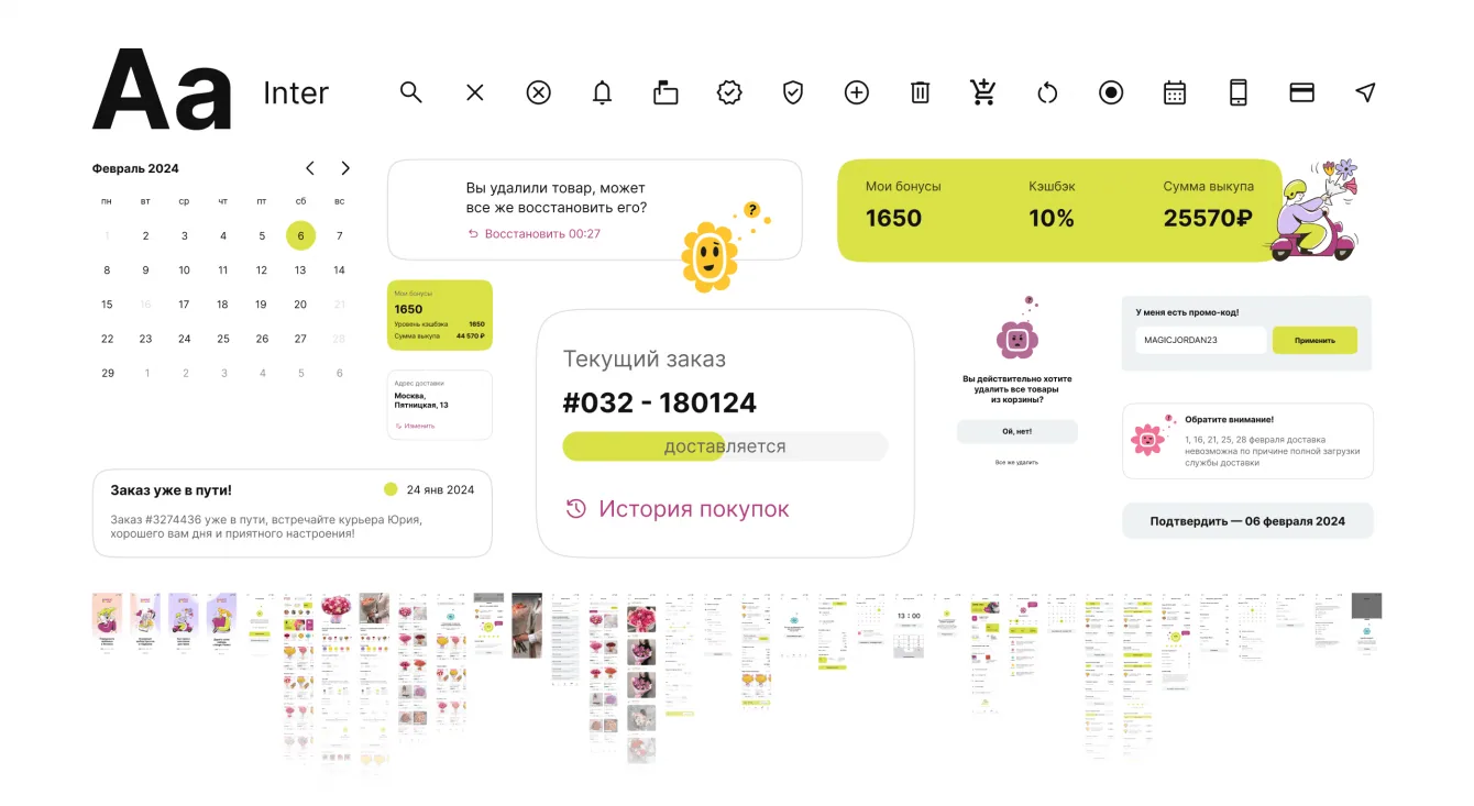
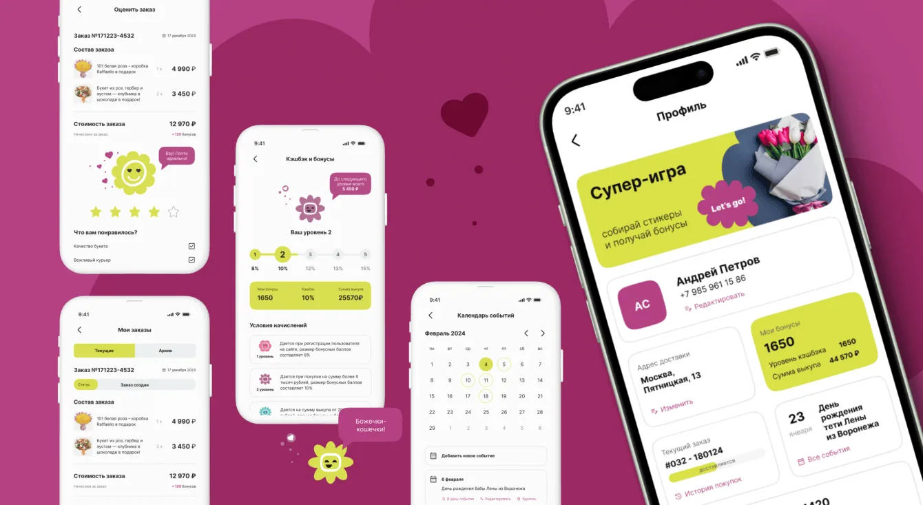
After assembling the UI kit, we designed the screens and developed the flower mascots into interface characters. Their expressions change with the context: cheerful, thoughtful or surprised.

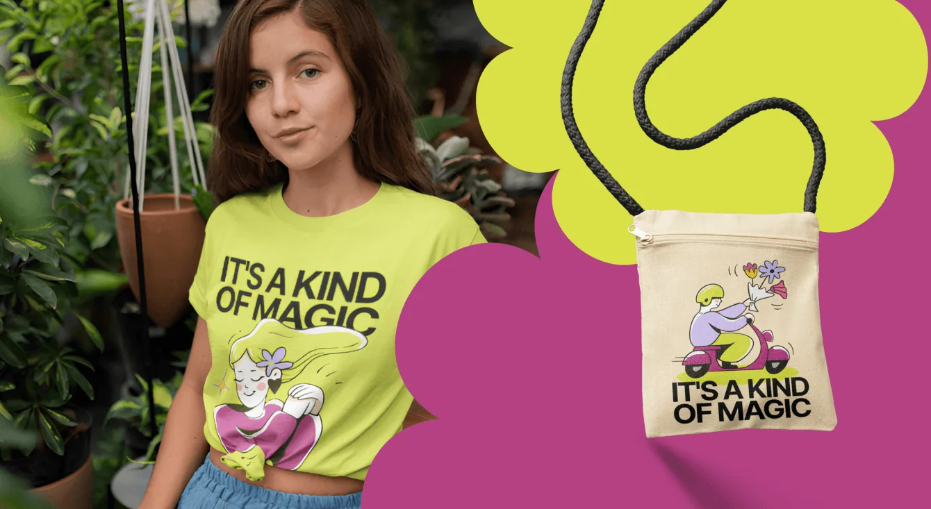
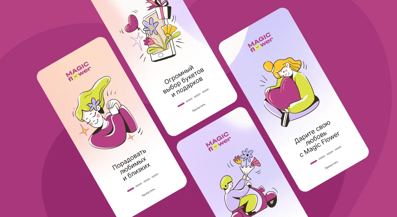
For onboarding, we illustrated a woman waiting for a bouquet and a courier delivering it. These scenes explain the service while establishing its tone.
The result and the visual system
We delivered the mobile app design from structure and prototype through to the UI kit, screens and character states. The ordering flow takes customers from bouquet selection to delivery details.
The onboarding illustrations also work beyond digital interfaces, on cards, packaging, T-shirts and other merchandise.
The client asked us to bring the same visual language to the website. Both products were in development when the original article was published. The design case received a Dprofile feature in the Interfaces category.